
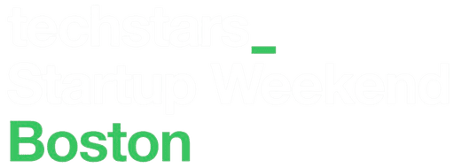
techstars startup weekEnd boston
A thrilling 3 day weekend event (54 hours), where you take an idea and build it. With the help mentors, you will learn what matters while building an idea into a startup.
opportunity
Steve Vilkas, Co-Director of Boston New Technology (BNT) asked if I could assist with designing, knowing my keen interest in the field. He offered me the opportunity to join BNT and design the SWB website for 2024, to which I gladly agreed.

Steve Vilkas
Co-Director, BNT
The website is fundamentally broken. It's not performing as needed with the navigation and it is confusing people.
website stats
2023's event had about 75+ registrations. This time, woohoo we hit our target.
0
1
2
3
4
5
6
7
8
9
0
1
2
3
4
5
6
7
8
9
0
1
2
3
4
5
6
7
8
9
registrations
WE'RE SOLD OUT!!!
0
1
2
3
4
5
6
7
8
9
0
1
2
3
4
5
6
7
8
9
0
1
2
3
4
5
6
7
8
9
avg. site visits a week
issues old site had
From 13 user interviews taken we knew the website was lacking in several areas:
too much unorganized content
website was way too long
nav / content wasn't intuitive enough
users felt less motivated to register because they didn't have enough information
Let's see a video of old website..,
Some key comments from the user interview :

Anon User #1
I was interested in coming to this event that's why I went through the website for almost 5 minutes to get the information I needed. But it's very frustrating to keep scrolling.

Anon User #2
I didn't wanna go through the website because I wasn't interested to. I straight went to buy tickets.
information the user wants
As a user, what do they want to know immediately?
What is Techstars Startup Weekend?
When is it?
What will I get if I attend it?
what do we want to show the users?
What key information should we highlight to increase user engagement?
Mentors and Judges list - there are qualified mentors and judges who can be of great help for people who are starting out
Past Events photos and videos
Location - the location plays a major role in attracting students
Easily understandable agenda
Easy to reach 'Contact Us'
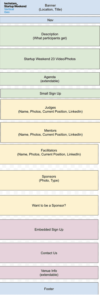
the architecture
Content management was a key thing for us to focus on.
constraints
The old website, was hosted on GoDaddy. So we were asked to work with GoDaddy as well. I'm familiar with Wix, Squarespace so I thought, "Shouldn't be difficult to learn", right? WRONG.
A day trying to design a simple hero section in GoDaddy, made me feel like :
So, I knew I couldn't design creatively with a constrictive environment. I proposed that we move to Framer and after debating the pros and cons, we did!!!
The second was Branding Guidelines by Techstars - this was actually helpful because we were given the color palette to follow, fonts to use; all of the preliminary decisions were made by Techstars.
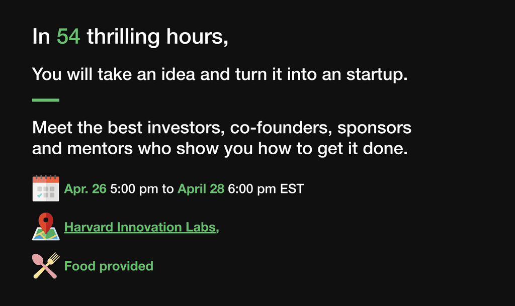
THE HERO
Grabbing the user's attention in the first 10 - 15 seconds is essential. And that starts with the hero text, the catchy phrase. That's when I landed with this :
"Where an Event Becomes a Thriving Community"
Next, I aimed to summarize the event's value upfront for users. Along with the venue, date and meals information.
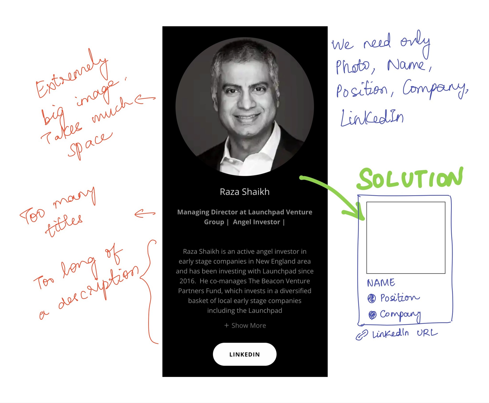
THE PEOPLE CARDS
Judges, Mentors - everything was categorized as peoples cards. Let's see how I broke it down :
more information
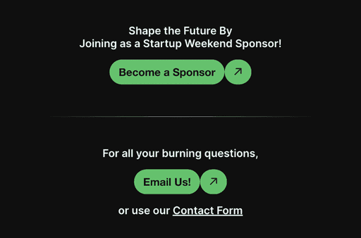
Become a Sponsor and Contact Us section has just gotten more better (the separators are my special touch)
BETTER IDEAS
Working as a team, one can always have better ideas than other. How you convey it matters. We had one such situation about "Venue". So, I proposed a new design in the following manner :
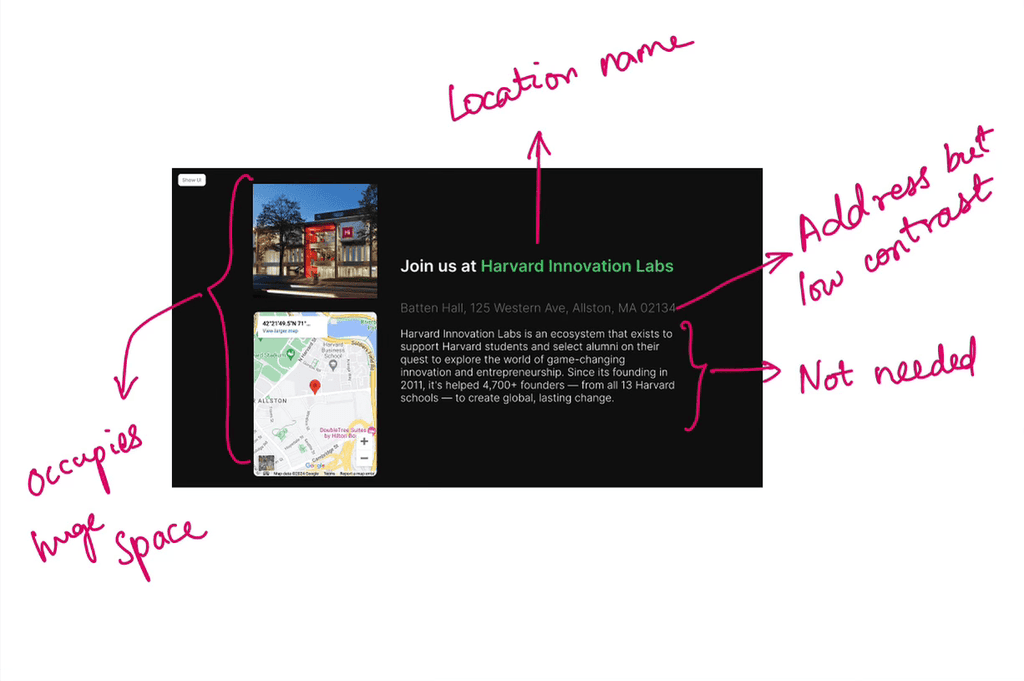
OLD
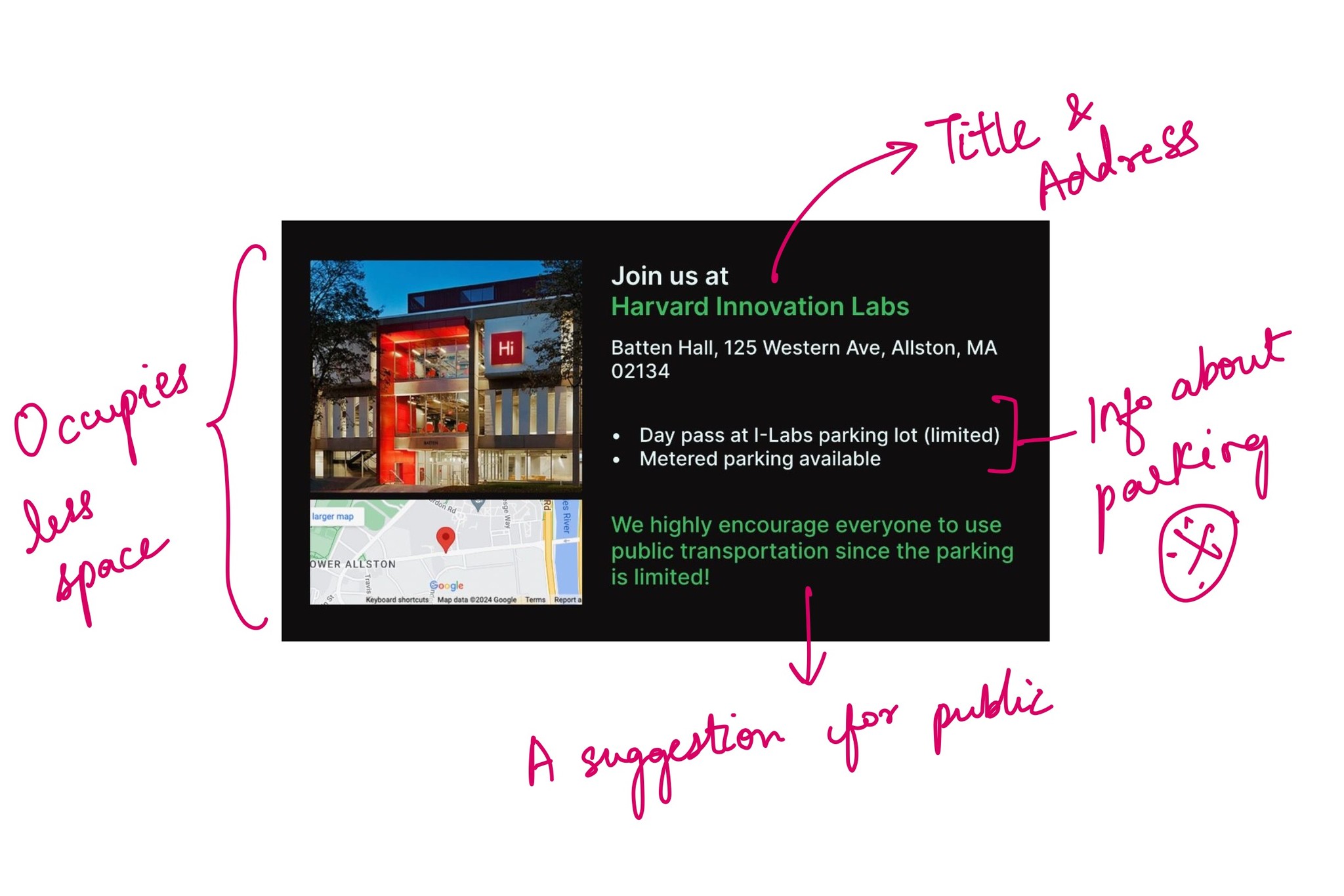
NEW
ARE PEOPLE HAPPY?
Subsequent usability testing following the website's deployment has significantly highlighted user contentment, showcasing that new users are finding the site not only easier to navigate but are also locating the information they seek with much more ease.
This improvement in the website's user interface has evidently made a noticeable impact on the overall user experience.
Steve Vilkas
Co-Director, BNT
The new one looks clean, professional and tells me what I need to know. It doesn't distract me and intrigues me to know more.
It's a 11/10 where 11 is like a billion and 10 is just a 10.
Anon User #1

Evan Smith
I want to emphasize how much startup weekend’s website influenced me to sign up. Every little detail + the excitement is what pushed me to reach out to the event manager with my questions, etc.
overall
This was a fun project with a great Captain and an amazing team. I learned about taking charge and being a teammate at the same time.

See how I led end to end product design to reduce retailers’ decision time by 80%