REFINED SCREENS


Other majorly changed screens,
Other majorly changed screens,
Other majorly changed screens,

Accordions are great for mobile designs. Then why move from accordion to cards?
Accordions are great for mobile designs. Then why move from accordion to cards?
Accordions are great for mobile designs. Then why move from accordion to cards?
While researching about accordions I found that even though they are great because they condense information in limited space, they also increase user disorientation. Additionally, when the content under the accordion is too lengthy, they can force users to scroll too much to collapse the accordion.
While researching about accordions I found that even though they are great because they condense information in limited space, they also increase user disorientation. Additionally, when the content under the accordion is too lengthy, they can force users to scroll too much to collapse the accordion.
While researching about accordions I found that even though they are great because they condense information in limited space, they also increase user disorientation. Additionally, when the content under the accordion is too lengthy, they can force users to scroll too much to collapse the accordion.
This is where I had to remind myself that I am not the user, I am designing for the users.
This is where I had to remind myself that I am not the user, I am designing for the users.
This is where I had to remind myself that I am not the user, I am designing for the users.
USABILITY TEST - PHASE TWO
USABILITY TEST - PHASE TWO
USABILITY TEST - PHASE TWO
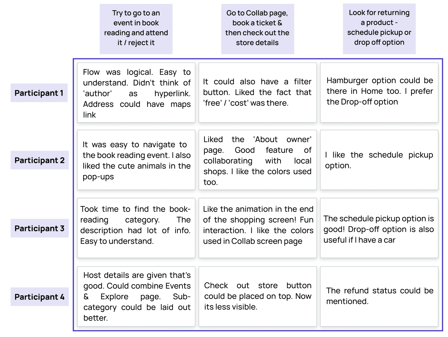
With the refined screens, the app was complete. As the facilitator, I gave some tasks to the participants of my usability testing. I noted down their behavior and thoughts as they went through the app.
With the refined screens, the app was complete. As the facilitator, I gave some tasks to the participants of my usability testing. I noted down their behavior and thoughts as they went through the app.
With the refined screens, the app was complete. As the facilitator, I gave some tasks to the participants of my usability testing. I noted down their behavior and thoughts as they went through the app.
POST-TEST ANALYSIS
POST-TEST ANALYSIS
POST-TEST ANALYSIS
WHAT DOES THE FUTURE HOLD?
WHAT DOES THE FUTURE HOLD?
WHAT DOES THE FUTURE HOLD?
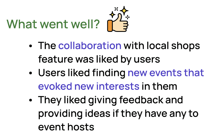

In future I would add a feature where tech events that take place, do it in collaboration for merchandising with local shops
User base can be expanded to cover event organizers and local shop owners to know what their plan is and incorporate it in the app accordingly
In future I would add a feature where tech events that take place, do it in collaboration for merchandising with local shops
User base can be expanded to cover event organizers and local shop owners to know what their plan is and incorporate it in the app accordingly
In future I would add a feature where tech events that take place, do it in collaboration for merchandising with local shops
User base can be expanded to cover event organizers and local shop owners to know what their plan is and incorporate it in the app accordingly
HIGH FIDELITY PROTOTYPES
HIGH FIDELITY PROTOTYPES
HIGH FIDELITY PROTOTYPES
Phase One: This phase of high fidelity prototypes has only certain amount of screens and not the entire app.
Phase One: This phase of high fidelity prototypes has only certain amount of screens and not the entire app.
Phase One: This phase of high fidelity prototypes has only certain amount of screens and not the entire app.


USABILITY TEST ONE
USABILITY TEST ONE
USABILITY TEST ONE
I assigned some tasks for the participants to do in my app and noted down what they were feeling as they carried them out.
TASKS :
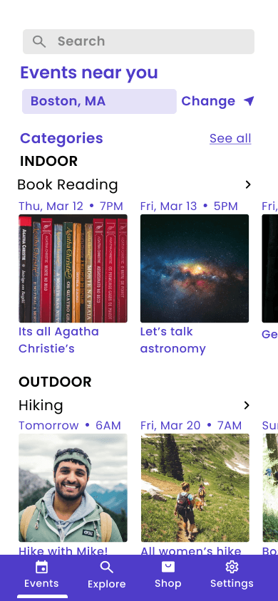
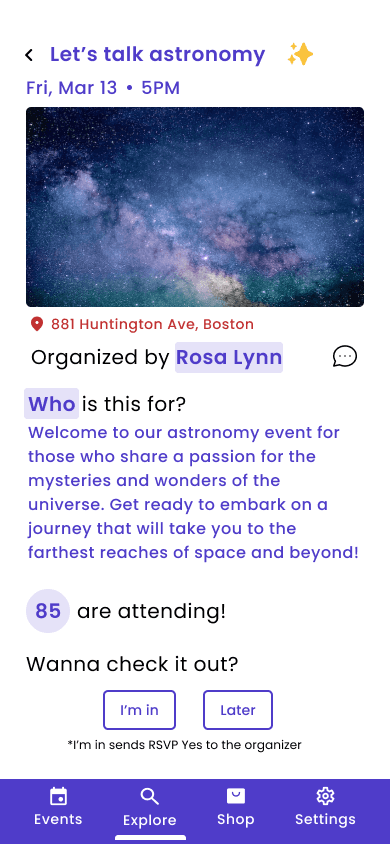
1. Try to go to an event in book reading and attend it / reject it
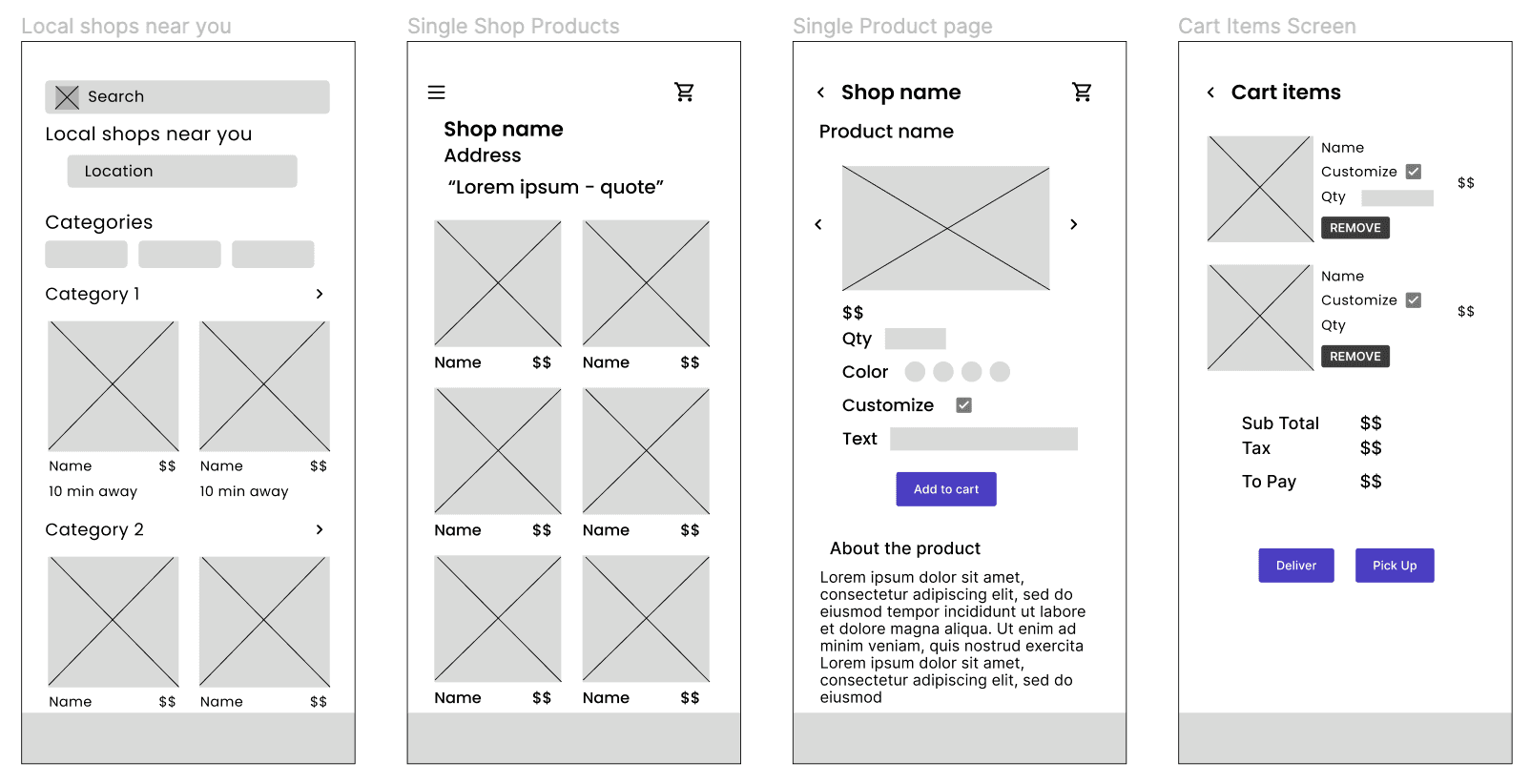
2. Shop for an item from Julie's - customize the product and purchase it
3. Look for returning a product - schedule pickup or drop it off
FEEDBACK :
1. The quote of the app looks confusing
2. The separation of timing and event name (top & bottom) style is not clear - I don’t like to look at two different places for information
3. I don’t like the structure & format of single events page - it seems chaotic
4. Navigation highlight could be improved
5. I don’t know if the events are paid / free
6. Highlighted text looks clickable in single events page but its not, so it’s confusing again
I assigned some tasks for the participants to do in my app and noted down what they were feeling as they carried them out.
TASKS :
1. Try to go to an event in book reading and attend it / reject it
2. Shop for an item from Julie's - customize the product and purchase it
3. Look for returning a product - schedule pickup or drop it off
FEEDBACK :
1. The quote of the app looks confusing
2. The separation of timing and event name (top & bottom) style is not clear - I don’t like to look at two different places for information
3. I don’t like the structure & format of single events page - it seems chaotic
4. Navigation highlight could be improved
5. I don’t know if the events are paid / free
6. Highlighted text looks clickable in single events page but its not, so it’s confusing again
MOVING TO HAND SKETCHES
MOVING TO HAND SKETCHES
MOVING TO HAND SKETCHES
With points from the prioritization matrix and POV statements, I started with preliminary hand sketches that helped me to visualize my idea.
I found one pattern to be recurring with my work flow.
With points from the prioritization matrix and POV statements, I started with preliminary hand sketches that helped me to visualize my idea.
I found one pattern to be recurring with my work flow.

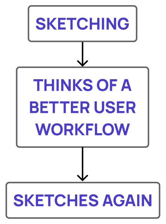
Even though it was tiresome to re-sketch repeatedly, I found this pattern of work flow to be fruitful. I was able to think of better solutions and features as and when I was sketching.
Even though it was tiresome to re-sketch repeatedly, I found this pattern of work flow to be fruitful. I was able to think of better solutions and features as and when I was sketching.
Even though it was tiresome to re-sketch repeatedly, I found this pattern of work flow to be fruitful. I was able to think of better solutions and features as and when I was sketching.
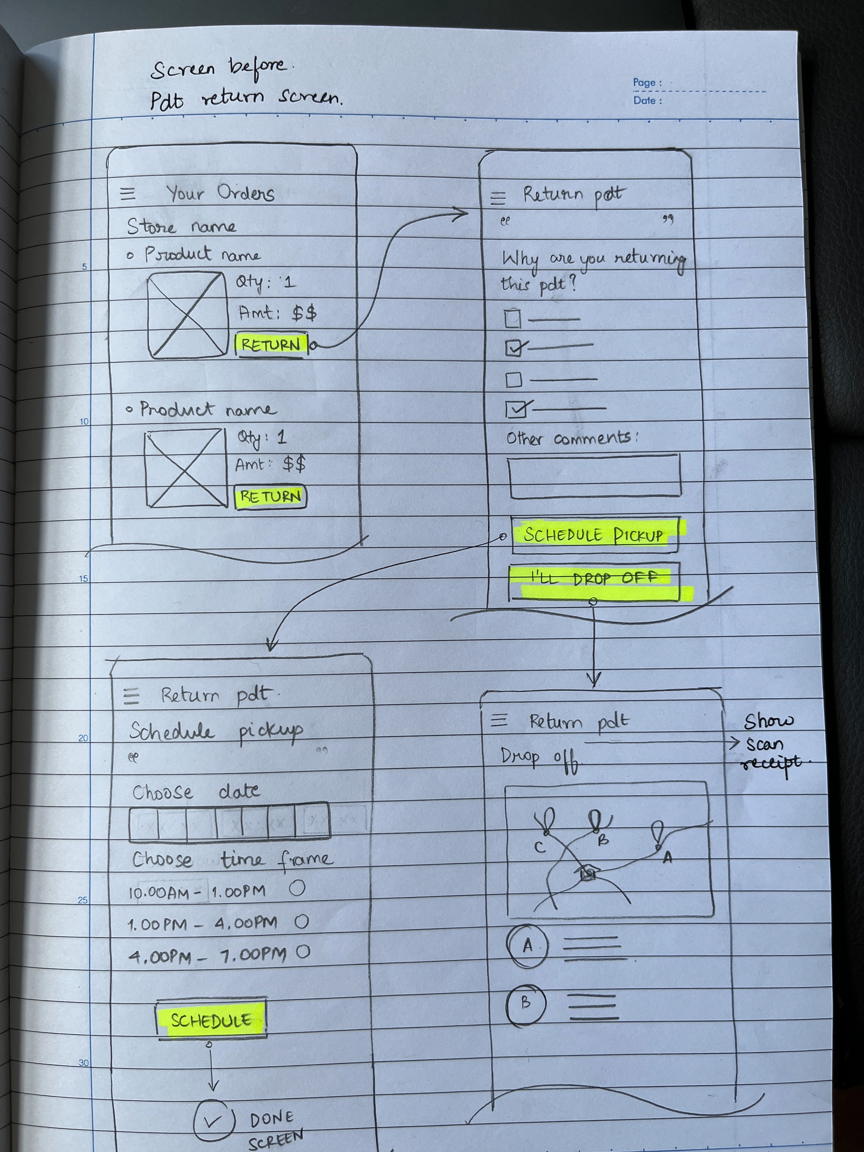

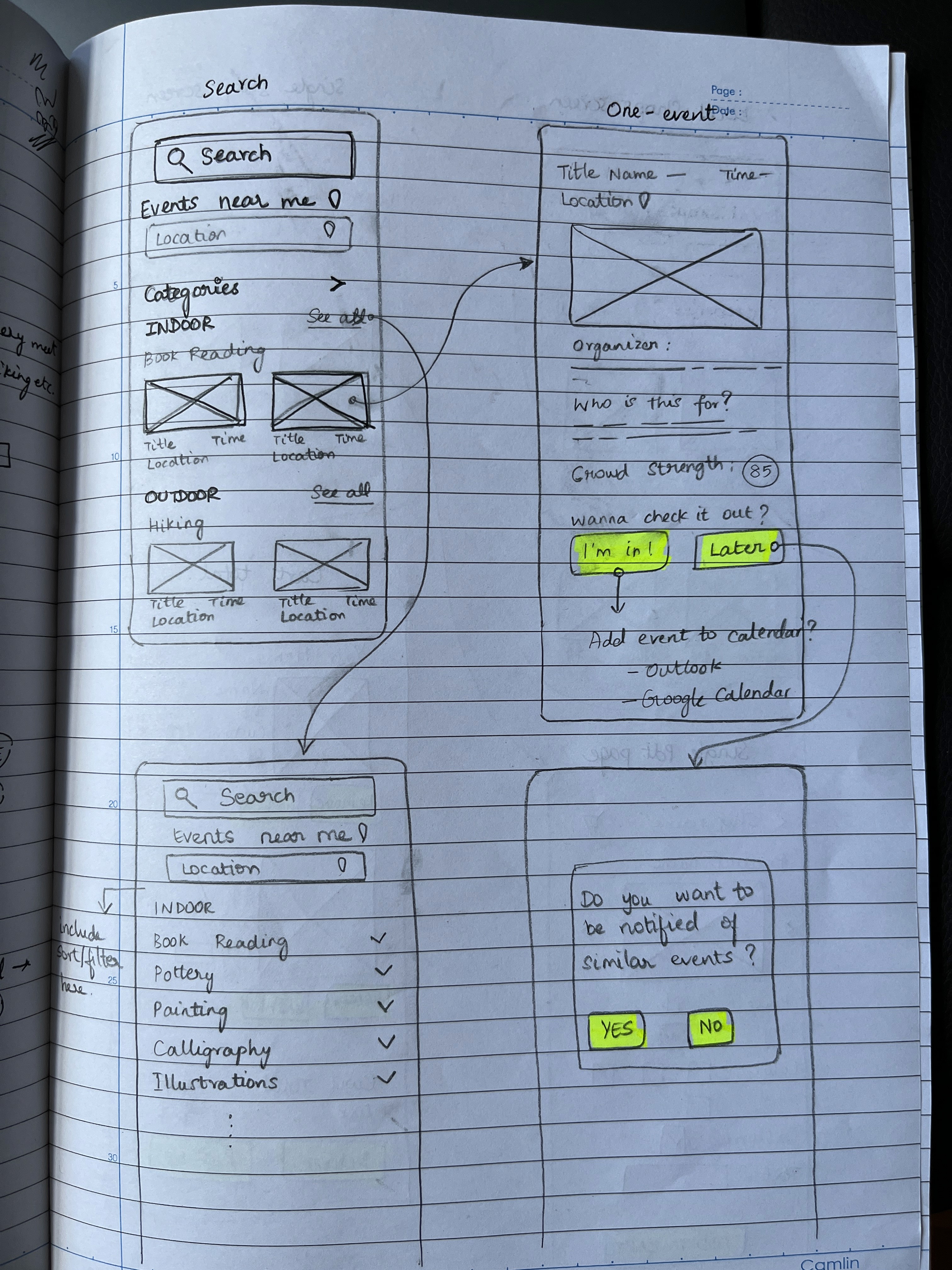
Fig (a) Handsketches.
Fig (a) Handsketches.
Fig (a) Handsketches.
WIREFRAMING
WIREFRAMING
WIREFRAMING
This step was considerably easy because I spent good amount of time on my hand sketches (at least main screens). But this step was also challenging because I wanted to come up with the typography and color palette for my app.
I wanted my font and color palette to be accessible.
This step was considerably easy because I spent good amount of time on my hand sketches (at least main screens). But this step was also challenging because I wanted to come up with the typography and color palette for my app.
I wanted my font and color palette to be accessible.
This step was considerably easy because I spent good amount of time on my hand sketches (at least main screens). But this step was also challenging because I wanted to come up with the typography and color palette for my app.
I wanted my font and color palette to be accessible.

EMPATHIZING WITH THE USER
EMPATHIZING WITH THE USER
EMPATHIZING WITH THE USER
To understand more about the difficulties, I conducted user interviews with participants of diverse backgrounds. This helped me to mold a solution that would help a large user base.
To understand more about the difficulties, I conducted user interviews with participants of diverse backgrounds. This helped me to mold a solution that would help a large user base.
INTERVIEW GOALS
INTERVIEW GOALS
I want to know how people define and see their community
I want to know how people get to know about local businesses & talents around them
I want to know how people define and see their community
I want to know how people get to know about local businesses & talents around them
I want to know how people define and see their community
I want to know how people get to know about local businesses & talents around them
INTERVIEW INSIGHTS
INTERVIEW INSIGHTS
People want to be more interactive with their community but don’t know how to
They want to participate in people-mixer events but don’t have the time to put in extra effort
In any online purchase process, if they have to return the product they feel frustrated
People want to be more interactive with their community but don’t know how to
They want to participate in people-mixer events but don’t have the time to put in extra effort
In any online purchase process, if they have to return the product they feel frustrated
People want to be more interactive with their community but don’t know how to
They want to participate in people-mixer events but don’t have the time to put in extra effort
In any online purchase process, if they have to return the product they feel frustrated
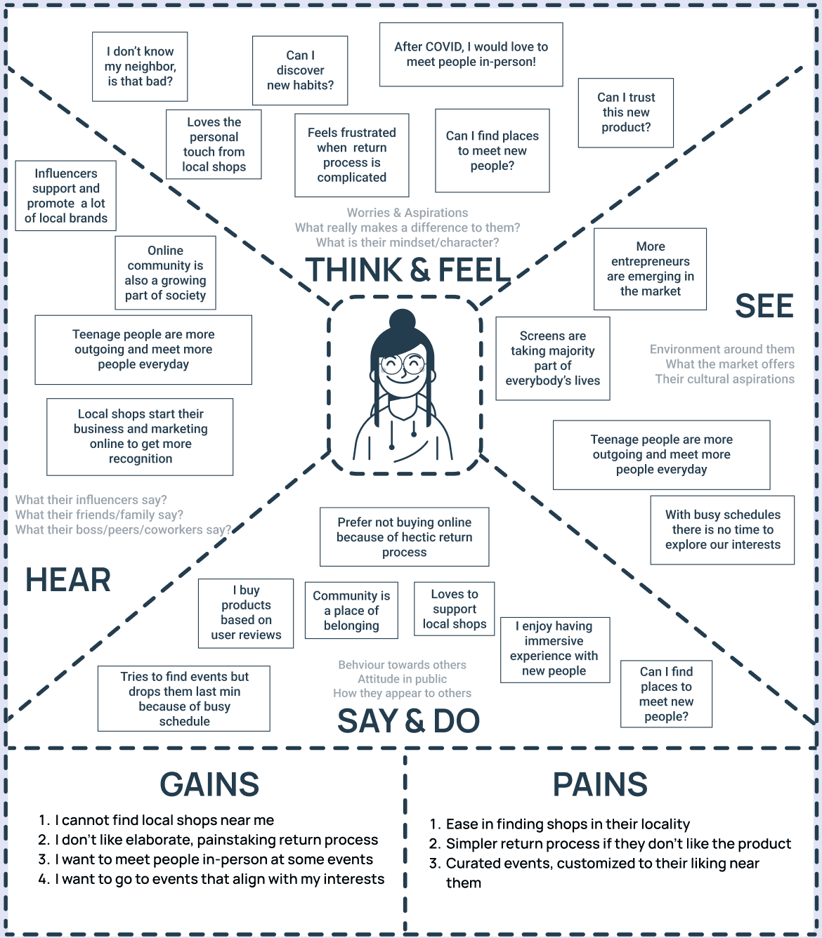
EMPATHY MAPPING
EMPATHY MAPPING
EMPATHY MAPPING
MULTIPLE POV STATEMENTS
SUMMARIZED PAIN POINTS
SUMMARIZED PAIN POINTS
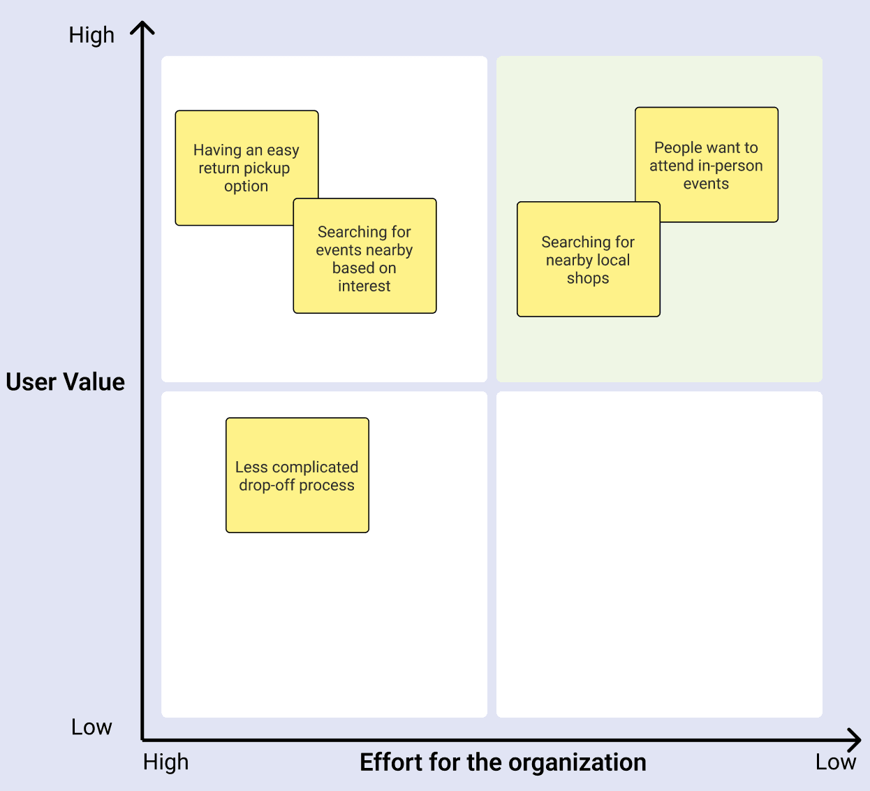
A prioritization matrix helped me make decisions by narrowing options down by systematically comparing choices through the selection, weighing, and application of criteria
A prioritization matrix helped me make decisions by narrowing options down by systematically comparing choices through the selection, weighing, and application of criteria
PRIORITIZATION MATRIX
A prioritization matrix helped me make decisions by narrowing options down by systematically comparing choices through the selection, weighing, and application of criteria
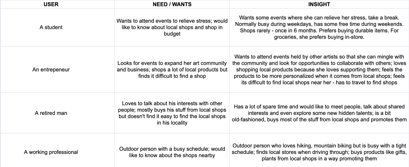


OUR PERSONA
Our persona is based on an entrepreneur


PRIORITIZATION MATRIX
DESIGN PROCESS :
DESIGN PROCESS :

Empathize

Define

Ideate

Test

Implement

Prototype
How it went for me
How it went for me
Prototype
Ideate
Define

Empathize
Test

Implement
DESIGN PROCESS: How it went for me
Empathize
Define
Ideate
Prototype
Test
Implement
KEY FEATURES
KEY FEATURES


MULTIPLE POV STATEMENTS
OUR PERSONA
SUMMARIZED PAIN POINTS
prioritization matrix
PROBLEM
STATEMENT
PROBLEM
STATEMENT
In today’s lifestyle where everything starts and ends with a screen, social engagement has drastically reduced. People find it difficult engaging with their community because of this. They are also unaware about their locality i.e new talents and businesses that open up near them.
In today’s lifestyle where everything starts and ends with a screen, social engagement has drastically reduced. People find it difficult engaging with their community because of this. They are also unaware about their locality i.e new talents and businesses that open up near them.
In today’s lifestyle where everything starts and ends with a screen, social engagement has drastically reduced. People find it difficult engaging with their community because of this. They are also unaware about their locality i.e new talents and businesses that open up near them.
Create a versatile platform that helps people to get engage more with their community & be updated about the shops & talents in their locality
Create a versatile platform that helps people to get engage more with their community & be updated about the shops & talents in their locality
Create a versatile platform that helps people to get engage more with their community & be updated about the shops & talents in their locality
THE GOAL
THE GOAL

HOME